|
|
Post by SharksFan99 on Dec 17, 2018 21:46:59 GMT 10
I got the idea for this thread after spending most of the evening reading album reviews on Rate Your Music. What are some awful album covers that you can think of?  There are some great songs on Cloud Nine, but the album cover is simply atrocious. It's like something a middle-aged Dad would make to try and convince his young kids that he's still "hip". That's not to discredit George Harrison in any way, but i'm not going to excuse an album cover which is hilariously awful in so many ways. The '80s weren't all great.  I wish I could say that this was something that someone whipped up on Photoshop, but unfortunately it isn't the case. It makes me wonder what must have been going through Ringo's mind to not only come up with such an off-putting title, but to also make such a ridiculously cheesy album cover. If you were to judge the album on it's own merit, you'd never in a million years think that Ringo Starr was the drummer of one of the greatest bands in the history of popular music. By the way, why is Ringo's skin green?  If Creed wanted to establish any little credibility they could have possibly had, they certainly didn't help themselves by producing an album cover that looks like something an inexperienced high school kid whipped up. Unfortunately, for Creed's sake, Human Clay was by far their best selling album and it spawned many of their most well-known hits, such as "With Arms Wide Open" and "Higher". As a result, this is likely the image that will greet any person who is even remotely interested in listening to their music.
|
|
|
|
Post by #Infinity on Dec 18, 2018 15:22:31 GMT 10
SharksFan99 , your cover arts aren't displaying.  This album flopped hard. Based on the creepy expression on this guys face, accompanied by several hands covering his privates at once, it's not hard to understand why.  Doesn't anybody else feel disturbed by this? I don't at all get this needlessly creepy artwork for an otherwise innocuous drum & bass producer's album sleeves. He's super acclaimed in the indie music world, but this just repels me from diving into his stuff.  A once glamorous pop diva suddenly takes a radical turn for the worse in her fashion sense. Even over a year since this record's stumbled release, my eyes keep instinctively tell me Katy Perry is trying to be a vampire, because the eyeball-in-mouth looks like fangs from a distance. It's just a mess.  To be fair, I don't actually hate this album cover, but boy oh boy, is it laughably ridiculous! Collective Soul were always pretty radio-oriented, but their mid-90s output at least sounded like rootsy, raw alternative rock, in spite of how positive and melodious it was. This, however, with its sqeaky-clean, photoshop-polished, cybernetic aesthetic, complete with headshots of all the band members, makes them look like a boyband, not helped by the fact that it was released in 2000, when the teen pop craze was still in its peak. Surprisingly, unlike Maroon 5, Fall Out Boy, Panic! At the Disco, or any other rock band who devolved into a full-on synthesized pop band, Collective Soul still remained purely rock here, even though Blender is definitely more polished than their previous works.
SharksFan99 likes this
|
|
|
|
Post by SharksFan99 on Dec 18, 2018 15:58:05 GMT 10
Oh, that's strange. Are they displaying now? I've re-uploaded the photos, so hopefully that helps. I agree, it's completely off-putting. You wouldn't like to think that the artist was hoping to achieve any sort of commercial success in the mainstream with an album cover like that. It's an interesting choice of design, to say the least. The decision to design the album cover in that manner could very well have alienated their existing fan base and resulted in the band losing all of their credibility in the alternative-rock scene. I can understand the motive for designing the album cover that way, however. It was probably intended as being a last-ditch effort to retain any relevancy in the mainstream and their record label undoubtedly would have pressured Collective Soul to try and replicate the success that they had achieved in the Mid '90s. Still, like you mentioned though, it's a bizarre choice of design and it's one that is hilariously bad.
|
|
|
|
Post by Telso on Dec 19, 2018 8:06:31 GMT 10
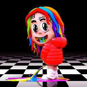
 The Archies - Everything's Archie (1969) The Archies - Everything's Archie (1969)A rather lame one. The fact they're wearing their own band t-shirts is pretty distracting and comes off as a cheap advertissement. I'm guessing they're dancing and are supposed to have fun on that scene, but one of the band members looks quite distressed and thoughtful, and kind of makes the whole thing forced and awkward looking.  Black Sabbath - Paranoid (1970) Black Sabbath - Paranoid (1970)I dunno what they were thinking here, but it actually delights me how agreeably one of the very first metal albums of all time has a cover this silly, and gets even sillier the more you stare at it. Fact only made worse knowing their self-titled album came earlier the same year and had a far more suitable cover.  Queen - The Miracle (1989) Queen - The Miracle (1989)Pretty classic pick, but it still makes me uncomfortable to look at. This is also one of the very last Queen albums with Freddie Mercury before his tragic death (this one was actually the first produced after Freddie's diagnosis of HIV).  M.C. Hammer - Inside Out (1995) M.C. Hammer - Inside Out (1995)Yeah... The tragic looking covers probably didn't help how unpopular this guy was becoming at this point. :format(jpeg):mode_rgb():quality(90)/discogs-images/R-2435198-1283885283.jpeg.jpg) Limp Bizkit - Chocolate Starfish and the Hot Dog Flavored Water (2000) Limp Bizkit - Chocolate Starfish and the Hot Dog Flavored Water (2000) Not only do I don't like most of their stuff, but this particularly cover is a bad mix of random, silly and oddly disturbing. Which I'm guessing is the point, but that still doesn't hold it from looking terrible for me.  6ix9ine - Dummy Boy (2018) 6ix9ine - Dummy Boy (2018)Again this is probably meant to be obnoxious looking on purpose, knowing the whole shtick of this artist. But the gaudy saturated colors and the detestable humor still makes me want to slap this guy in the face.
|
|
|
|
Post by .savage on Jan 16, 2019 4:55:38 GMT 10
I love Christina but this wasn't it. 
|
|
|
|
Post by #Infinity on Jan 25, 2019 3:49:40 GMT 10
  I would probably like Sia a whole lot more if not for her nauseatingly pretentious public image, like she’s too good to aim for aesthetic beauty, so she tries to be anonymous despite not being so back when she started as an indie pop singer, so she shoves these repulsive sour-faced pictures at us instead. I strongly prefer music that’s proud enough of what it is that it doesn’t feel the need to be unpleasantly ironic just for the sake of irony.
Telso likes this
|
|
